Balance Sheet Visual – Basics
The Balance Sheet custom visual for Power BI is quite simple to use, we still wanted to summarize the main functionalities in one knowledge base article to give our users a place to start.
Let's assume that we are loading data as shown in the table below
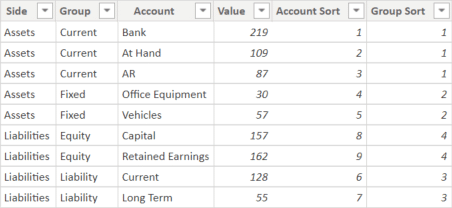
The column Side shows to which side of the balance sheet (Assets or Liabilities) a record belongs.
The column Group contains a group of accounts. In most cases, this level gives a good overview of the balance sheet data. If more details are needed, a level Account can also be added. In general, the side must be included in the visual and at least one granularity level below. It's also important to know that there can only be 2 sides. If the added column contains more than 2 elements, the visual will return an error message.
The Value contains the amount. Please be aware that only positive values are displayed in the visual
The columns Account Sort and Group Sort are needed in case a custom sort order logic should be used. If there's no specific sort order, then the visual can either be sorted by value or alphabetically.
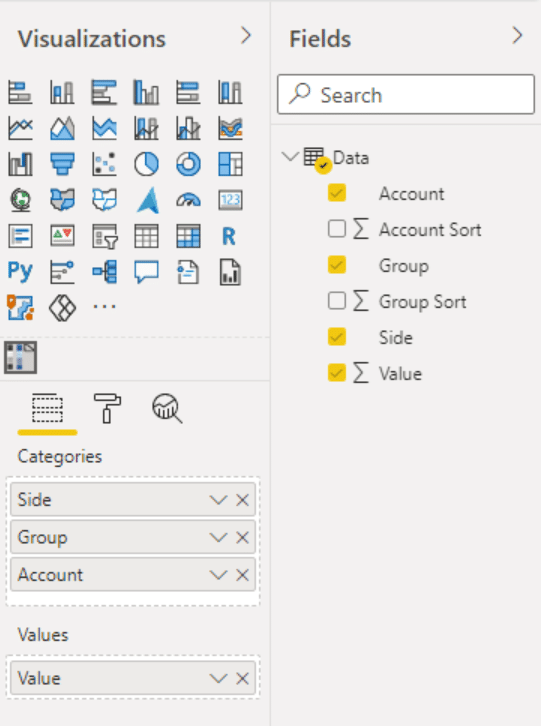
Adding fields to the placeholders
It's important to add the fields into the Categories placeholder in the correct order. The least granular column (Side) should be on top, followed by Group and then the lowest most granular level (Account).
You can either add a value column into the Values placeholder or create a measure and add the measure into the visual.
Now you have displayed a very basic Balance Sheet
The default look of the Balance Sheet might not be what you want to display in your report. Luckily, we have added a lot of formatting options to the visual. Keep on reading in the Knowledge Base to find out how to format the visual so it fits your needs. Maybe you want to add your corporate color theme or adjust the bar width so the visual uses less space?
Please be aware that additional formatting options are only available with a valid license. What you can use without the license are the arrow buttons to expand or collapse the view. Also, clicking on a value will change it from absolute to relative. Give it a try.
The sample report below is a collection of all of the features of the Balance Sheet Visual for Power BI.
Demo Report
Now that you know the basics, it's time to learn some of the settings and features of the Balance Sheet Visual. You might want to start with hiding/showing totals or defining the perfect color schema. There are many other settings available that allow you to format the visual exactly the way you like. In case your balance sheet is not balanced, you might want to learn how to automatically calculate and add a bar for the difference.
If there’s a setting that we haven’t thought of yet or if you would like to request an additional feature, simply reach out to support@bisamurai.com. We’re always on the lookout to improve our visuals and hearing the user’s requirements is important to us. Also, if you like working with our visuals, your feedback and rating on Microsoft AppSource would be highly appreciated.