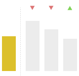
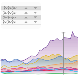
The visual was developed to offer more options for comparing data.
There’s currently no way to compare a category against others in Power BI without extensive work and combining multiple charts together.
That’s why, with the Category Comparison Bar Chart you can dynamically and quickly compare categories against each other. The comparison area, the differences, the brush, the search, and the analytics together all transform the simple bar chart in a powerful visualization never seen before.
And the visual only becomes better with every feature we’re adding to it.
Check out the sample report to learn more about the visual and see some examples of how it can be used.
Check out the upcoming feature releases in order to see what you should expect with the improvement of the visual.
Roadmap:
We know the visual can do a few more important cool things. That’s why we’ve committed to add them in the next releases.
- Small multiples – will allow you to elevate your comparing ability to the power of how many dimensions you have. Imagine comparing the performance of your unit across all units and all competitor’s units and with it’s own history. In one visual.
- Your own measures in analytics – we know it’s probably an exaggeration, but it helps paint the picture – this will be what modding is to a game. It will allow you to write your own logic to the analysis.
- Invert axis – seeing categories placed one on top of each other is simply nice to have and sometimes better to get the point across


