In this Showroom, we are presenting some examples of our powerful ideas and products. With various visualizations and tools, we aim to simplify your day-to-day activities as well as bring visibility and improve data-driven decision-making in your organization. All our solutions are easily customizable to meet your requirements and reflect your company dynamic. We combine passion with business to produce great results.
Showroom samples using our custom visuals

Action Tracker
Great organizational skills can increase your efficiency at work! With this action tracker, we want to help you successfully manage your meetings, projects, actions, notes, and status updates. You can visualize and summarize all regular activities in one go through the HTML VizCreator for Power BI. Take a look and get in touch for more details.
How can you benefit?
- Consolidate many visual elements in one view – table, KPI, company data, color coding etc
- Easily convertible to PDF one-pager, you can create status updates and share via email (We recommend using Power Automate)
- This template is editable and can reflect the tracking approach you use in your organization
- Suitable for Power BI beginners with out-of-the-box design


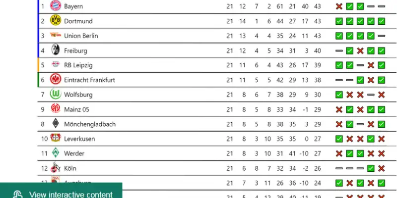
Bundesliga ranking
Power BI can also be used for non-business-related topics. One of our Power BI experts saw a post about the Bundesliga ranking table on social media and wanted to see how long it takes to recreate it in Power BI. It took him 17 minutes and he even made a video about it.
How can you benefit?
- First, realize that you can create any kind of table using the HTML VizCreator visuals.
- Tables can contain all sorts of elements so you can create a report using just one visual.
- Tables are pixel-perfect and you have control over every single element.
- If needed, anything can be made dynamic.
- You can finally create exactly the table you want in just a few minutes!


Invoices
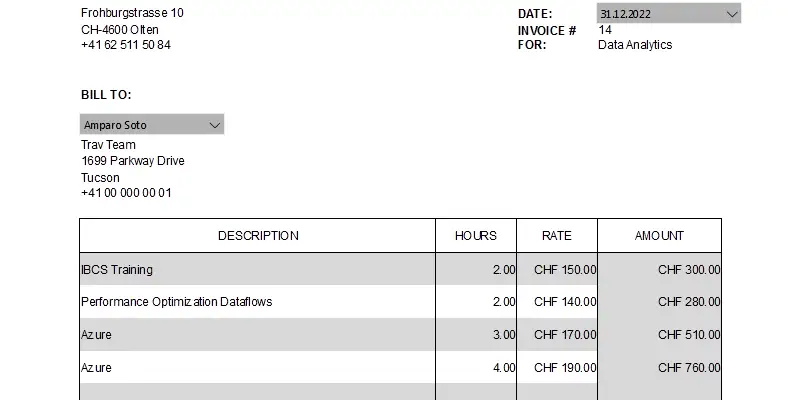
This invoice template was created with the HTML VizCreator Flex custom visual and represents a standard invoice layout every company issues each month.
Thanks to dynamic measures and date/client slicers you can save a lot of time creating invoices as well as looking for the right invoice. Instead of browsing through various folders, systems, and pdf files, you can have all your digital paperwork in one place ready to send, review and print in a few clicks.
How can you benefit?
- Automate the manual process of issuing invoices
- Automatically create PDF invoices and send them via email (We recommend using Power Automate)
- The template is editable and can be applied to other commonly used documents – delivery notes, credit/debit notes, payslips, certificates of origin, etc.
- Create a digital repository of all your documentation


Ecosystem
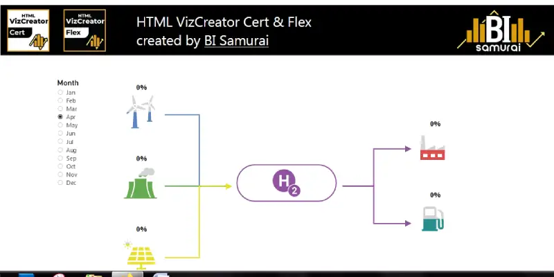
Storytelling is essential when displaying complex data. With the HTML VizCreator visuals, it is possible to create a custom visualization of nearly anything. In this example, we show a hydrogen ecosystem. The color fill of each icon is dynamic, depending on the value. Note how we animated the values and the arrows.
How can you benefit?
- Display complex data in a simple way
- Add animations to make it clear what users should focus on


Risk Matrix
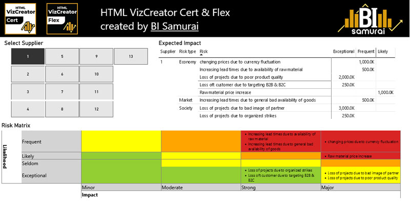
Running a business also means being exposed to certain risks. There are all kinds of threats coming from the economy, the market, politics and others. Tracking, analyzing and showing these risks to the right people is the first step in reducing and mitigating them. Until now, creating a fully dynamic risk matrix in Power BI was quite a difficult task, simply because there isn't the right visual to do so. With our HTML VizCreator visuals, it is finally possible to create the perfect risk matrix that looks and behaves exactly the way you like.
How can you benefit?
- Display complex data in a simple way
- Add custom tooltips to specific cells (When hovering over certain cells in the risk matrix in the sample report, you will see a tooltip)
- Add conditional formatting to any element you like to make sure users know what to focus on


Weekly Meal Plan
This time we want to show you that Power BI can bring value not only in corporate life and business. It can help you manage your usual weekly routines. Take a look at our meal plan featuring HTML VizCreator's scaling option and the perfect mobile version created just in a few clicks.
How can you benefit?
- Easy to share with friends and family on the mobile app
- The template is editable and can be applied to other common activities – weekly cleaning/laundry schedule, lesson/appointment planner, shopping needs, workshop/event/conference schedule, etc.
With the HTML VizCreator's scaling option, creating the perfect mobile version of a report is a matter of a few clicks.


Student Attendance Record
This visualization was created with the HTML VizCreator for Power BI during a meetup presentation at Akademie St. Gallen where we wanted to showcase the value and impact of digitalization in the education sector.
How can you benefit?
- Digitalize existing data assets
- All relevant information of data consolidated in one view
- Easy maintenance and data refresh
- Quick access and desirable increase in user engagement – for example, you can keep parents in the loop by sending this report as a PDF document
- The template is editable and can be applied to track other activities – meeting attendance, employee attendance record, student grade book, etc


Custom Bar Charts
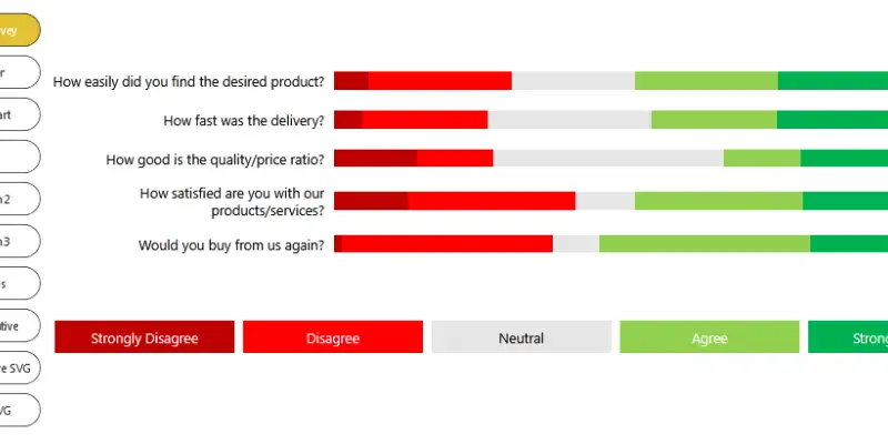
Bar charts are great to present and compare categorical data. Power BI comes with a couple of native bar chart visuals with many formatting options. But what if you want to have a bar chart visualization that can't be done with native functionality? Well, then it's time to use one of our HTML VizCreator custom visuals. They allow you to format any element of a bar chart exactly the way you like.
This can be done by just using HTML (in case you are using the Microsoft certified HTML VizCreator Cert visual) or also with SVG (this only works with the HTML VizCreator Flex).
The report below contains a couple of pages with different bar chart examples. The DAX/HTML used to create these charts can be adjusted to also work with your data model. If you need support with that or you need help creating a specific bar chart, just reach out to our support, we're happy to help.


Football Player Card
Just another fun example that was built by a football enthusiast on our team. Surely, the same technique could be adjusted to other scenarios.
The main structure of this card was built with our online HTML Editor and then imported to Power BI.
The pictures are saved in an Azure blob storage so they don't blow up the data model but are loaded on demand.
Other Power BI showroom samples


Sales Flash
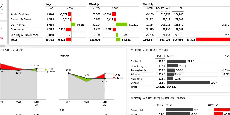
The Daily Sales Flash Power BI dashboard features a number of neat little tricks to allow users to get a clear view of their data on a daily basis. Each day you open this dashboard, you'll know exactly how you perform on a daily, weekly and monthly timescale. Additional pages allow you to dig deeper into the details of your sales and returns, or analyze trends.


Price-Volume-Mix Analysis
This Power BI example explains the reasons behind the revenue growth and presents top contributors for each category such as price, volume & mix variance, new launches, and discontinued products. If you ever thought doing Price-Volume-Mix in Power BI is tricky, then this is the solution for you.


Sales pipeline
The Sales Funnel template for Power BI lets you display your most important KPIs on one page. Additionally, it helps you track the conversions between them, provides immediate insights into the performance of your sales funnel, and enables you to understand your pipeline at a glance.


Financial Reporting with Zebra BI
This Power BI template is designed to help you make an actionable overview of financials for the management. Spoiler alert: it includes lots of waterfall charts.


HR Reporting with Zebra BI
The Human Resources Power BI dashboard allows users to get a clear overview of the company's employees and the most relevant top-level KPIs: Headcount, Salaries, Hires and Terminations. The 4 subsequent pages provide a more detailed view into each of the KPIs and the demographics.


Working Capital Analysis
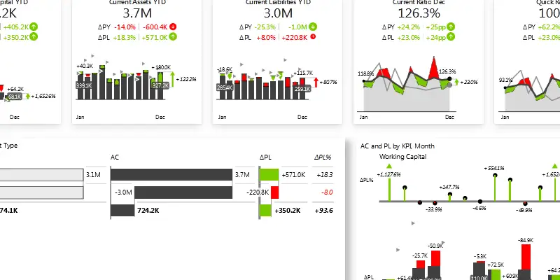
The Working Capital template for Power BI allows you to have a clear overview of the Current Assets, Current Liabilities and the difference between them - Working Capital. You can understand the balance sheet at a glance (visualized with vertical waterfall charts) and analyze the trends of each KPI.


Financial Statements with Zebra BI
This Power BI template is designed to help you structure, create, and design a user-friendly Income Statement. It shows you how to handle hierarchical datasets and contains several intermediate results and subtotals, that consist of both “good” and “bad” elements (e.g. revenues vs expenses), and require inserting additional performance indicators (e.g. percentages like Gross Margin in %, Operating income as % of Revenue), etc.
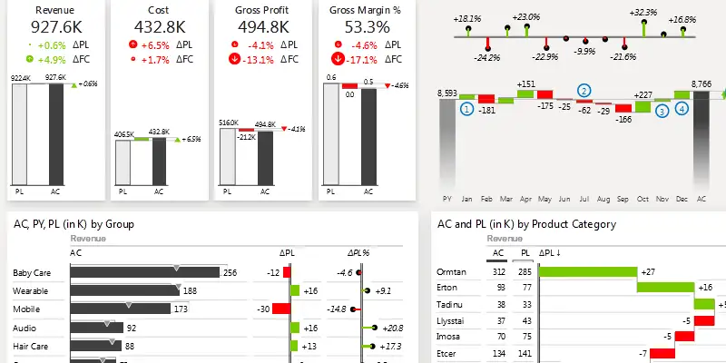


Sales Dashboard
This Power BI template is designed to help you make an actionable Sales Dashboard. It includes all the essential elements such as buttons, report page tooltips, drill-through buttons, drill-downs, top N charts, advanced small multiples, as well as DAX code and a ton of other Power BI dashboarding tips & tricks.