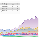
The visual was developed to offer more options for comparing data.
There’s currently no good way to compare categories over time in Power BI. Time series data is usually best visualized with line charts but there’s no line chart visual that handles multiple categories well.
That’s why, with the Multi Line Chart With Tooltips you can dynamically and quickly compare categories against each other. The card, stick, dynamic sorting highlighting and filtering together all transform the simple line chart in a powerful visualization never seen before.
And the visual only becomes better with every feature we’re adding to it. Check out the sample report to learn more about the visual and see some examples of how it can be used.
Check out the upcoming feature releases in order to see what you should expect with the improvement of the visual.
Roadmap
We know the visual can do a few more important cool things. That’s why we’ve committed to add them in the next releases.
- More options on the X axis – the goal is to have any sortable series work on the X axis. That includes numbers, hours, datetime
- Small multiples – when having all categories on top of each other is too much
- Grouping – this, together with small multiples, adds so much more. Imagine comparing the performance of stocks grouped by industry. In one visual.
- Legend & multiple values – we will figure out how to show multiple dimensions for the categories you want to analyze. For example, showing revenues, expenses and gross profits of multiple companies at once.
- Settings on the visual – to give viewers the ability to add / remove the cards and change some settings.


