Recently, I came across a LinkedIn post about an “Emoji Progress Chart” made with Qlik. Many people had already added comments to the post so it looked like adding smiley faces to a business report was considered a good idea (or just plain fun). I simply couldn’t resist recreating this in PowerBI using the HTML VizCreator Flex custom visual so I took up this challenge
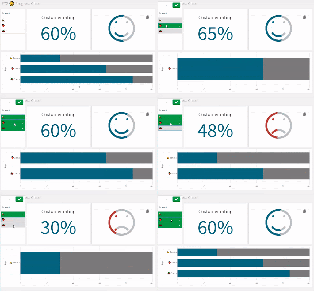
Here is a snippet of the Qlik report:
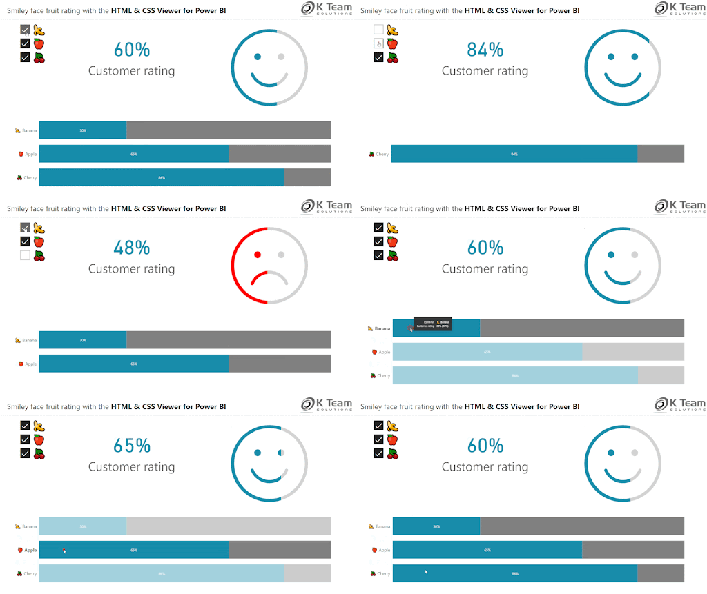
And this is what my report looks like in Power BI
With the help of the HTML VizCreator Flex and one of our SVG designers, building this was only a matter of minutes. So what’s included in this report?
We display a “Custom Rating” measure for each fruit in the category by incorporating the “Emoji” visual to the report using the HTML VizCreator Flex visual. Suppose the fruit has a high customer rating associated with it; The emoji will display a positive emote and a proportionate area of the Emoji colored to indicate a high percentage of satisfaction. Similarly, a low customer rating will be indicated by a negative emote and proportionately low coloring to indicate a lower percentage of customer satisfaction.
Of course, the colors of the Emoji are customizable. We can also specify a threshold value which will enable the visual to differentiate whether the value is high or low (positive or negative).
If you would like to build a similar report in PowerBI, we’d be happy to help you out. Our designers can create exactly the elements that you are looking for. Simply fill out this custom visual order form and we’ll get in touch with you.
If you’re curious to know more, we also have a video about a similar topic here. Make sure to check that out!


