Create visuals with PowerPoint SmartArt
Would you like to enhance your Power BI reports with SmartArt Design from PowerPoint? The HTML VizCreator Flex (old name: HTML & CSS Viewer) custom visual gives you the option to embed various graphics frequently drawn and presented on PowerPoint slides to display the organization’s structure, product categories, process diagrams etc.
To get started, prepare your own visualization in PowerPoint first. Make sure you reflect the data flow with titles and matching measure placeholders. This will give you an HTML frame to work with and edit in Power BI where you will be able to insert measures, texts, etc. In this example, placeholders represent country and region categories later replaced with measures and adequate colors.
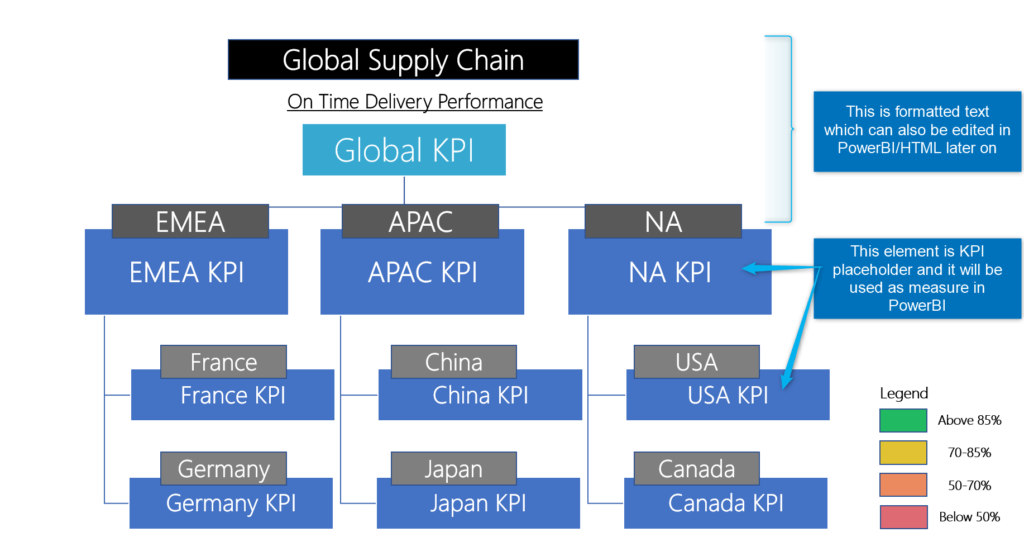
To retrieve HTML code, save your PowerPoint chart as an SVG type file and open it in your browser.
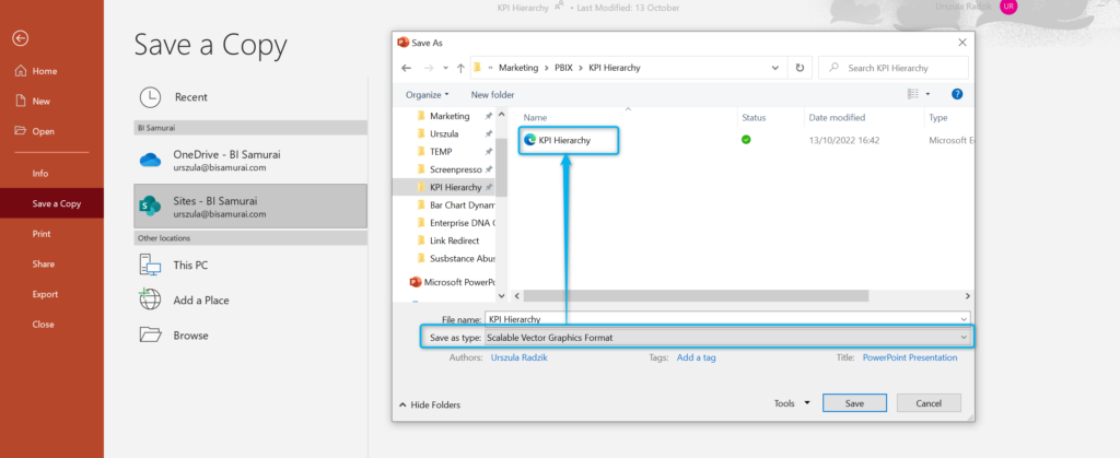
View the page source code in your browser.
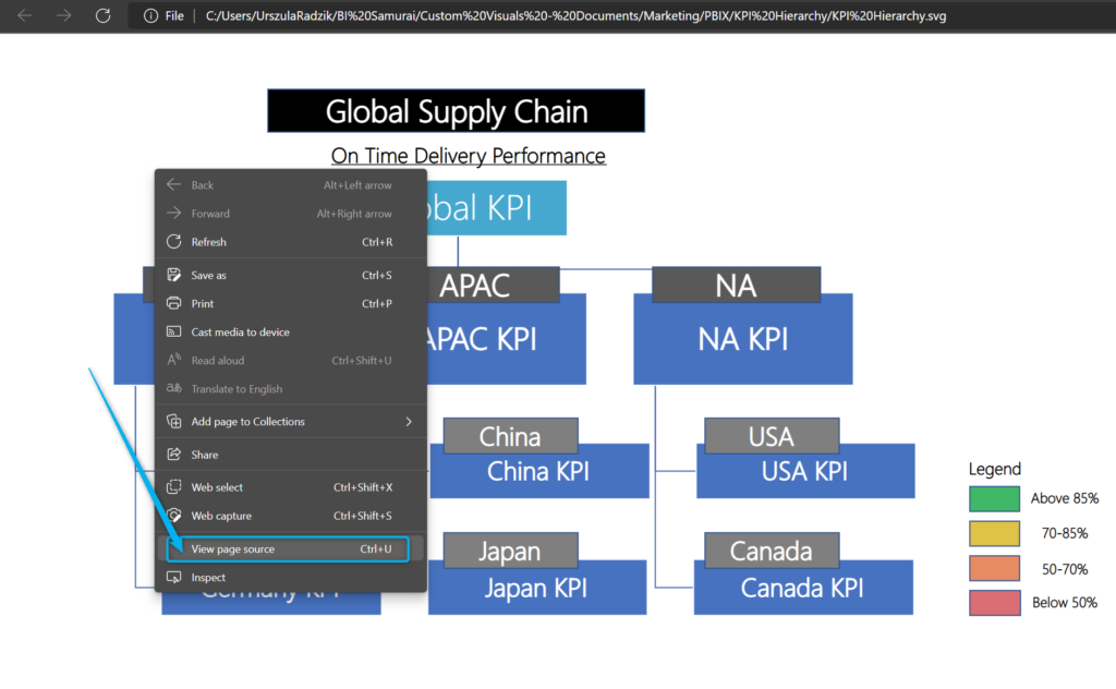
View page source will bring you to HTML code of your PowerPoint creation.
Copy the entire code, enter this code as Power BI measure and replace all “ characters with ' (You can use CTRL + L to replace selected characters). Add this new measure to the HTML VizCreator Flex and you will see the exact representation of the chart created in PowerPoint ready for you to develop further and incorporate any adjustments you would like to have.
Measures
Each metric in the graph is built with a separate pair of measures. We need these measures to make the chart dynamic and link it to our data model:
- Actual number KPI % calculated based on your source data
SC On Time Performance Global =

(CALCULATE(COUNT(SCPerformance[Shipment ID]),SCPerformance[Shipment Status]="On Time")/COUNT(SCPerformance[Shipment ID]))
- Background color formatting based on the result of the actual KPI %
SC On Time Performance Global Color =

VAR var_value = [SC On Time Performance Global]

RETURN

SWITCH(TRUE(),

var_value > 0.85 ,  "#21BA63",

var_value > 0.7  ,  "#E1C233",

var_value > 0.5  ,  "#EB895F",

var_value >= 0   ,  "#DE6A73",

"#B3B3B3")
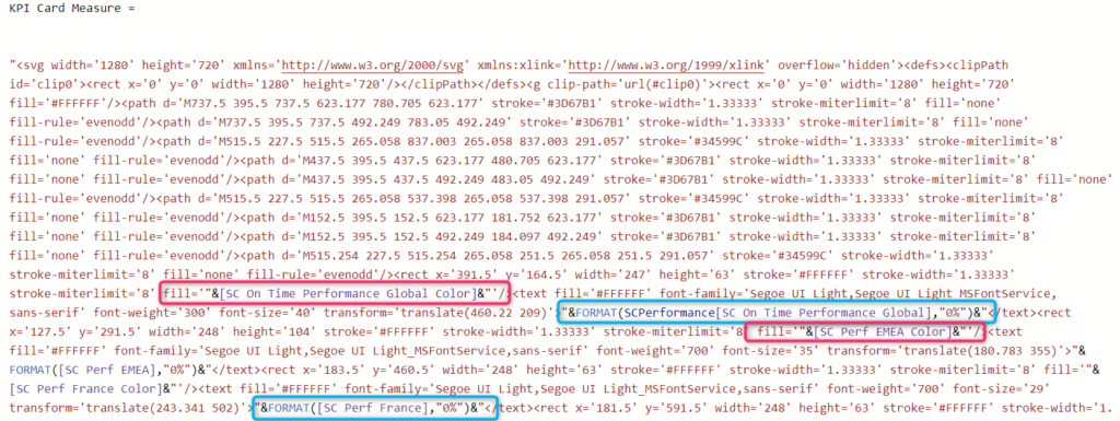
Both elements are used in the HTML code sourced from PowerPoint and in Power BI they are surrounded by “& &”. KPI measures are entered in previously assigned placeholders corresponding with each box/shape and in this example, color was used as a fill element of the HTML code.
Size
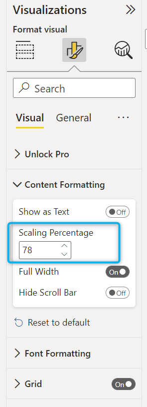
If needed we recommend using scaling percentage in the visual setting in order to fit the chart nicely on the page.
Demo Report
Next up, you could learn how to add an image slide show to Power BI.
